
Colour and Form


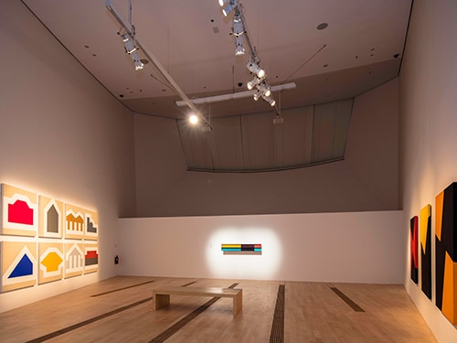
The absence of colour does not automatically mean something is minimal. While some artists chose to work with black, white or shades of grey, others chose to combine natural, or neutral tones, with brightly coloured industrial materials such as perspex, metal or paint. By working systematically, and using simple lines and shapes, many artists, including those seen in this gallery, were able to employ colour to create bold, abstract geometric forms that exhibited a highly minimalist aesthetic.
Intense colours were used in minimalist sculptures and installations too. When colours are particularly vivid, and shapes and forms kept simple, the viewer is encouraged to consider the space around and between art objects instead of the objects themselves. In this way the artwork draws attention to itself in relation to the space in which it sits.
 by Donald Judd.jpg)
Untitled (85-033) by Donald Judd (1985)
Painted aluminum
30 x 180 x 30 cm
Donald Judd referred to many of his Minimalist artworks, particularly his horizontal wall based pieces, as ‘specific objects’. For Judd these objects expressed aspects of both painting and sculpture but were not entirely one or the other. The sequence of box-shaped elements bolted together and fixed to the wall, is evidently a three dimensional sculptural object, whereas the choice of colours and the artist’s systematic approach to determining their placement suggests a much more painterly style. The work shown in this gallery was created more than a decade after the large floor based sculpture seen earlier in the exhibition. Many consider these works to demonstrate the artist’s return to the use of colour, whereas in fact he had always taken account of colour in his works, specifically the natural colours of the basic, or industrial materials that he often used.


Sunday by Carmen Herrera (1978)
Acrylic on canvas, 162.6 x 106.7 cm
In New York of the 1950s, Carmen Herrera encountered a less-than-welcoming art scene. Abstract Expressionism was at its high point and Herrera, a Latin American woman, was overlooked. Rather than resigning herself to obscurity she felt liberated. Her geometric hard-edged style of painting, that she retains to this day, employs a palette of just two or three colours. Herrera considers her paintings to be sculptural objects, using the physical structure of the canvas as a compositional tool taking into account the surrounding gallery environment. The three paintings here, from her Days of the Week series demonstrate Hererra’s continued fascination with figure/ground relationships.
Also on view are the works:
- Friday (1978)
- Thursday (1975)
 by Chen Shiau-Peng (2012–2016).jpg)
My Galleries VI–All Identical? (Surface–Entirety) by Chen Shiau-Peng (2012–2016)
Acrylic on canvas, 8 parts, 112 x 112 cm (each)
Simple geometries and hard edge abstraction involving few colours mark these works by Taiwanese artist Chen as Minimalist. Chen’s works are often created in response to architectural forms, so they begin in three dimensional space. For this series the artist responded to the contours of gallery buildings, her feelings and impressions of those buildings. Her works — that could almost appear as logos — are grouped into two sets, one representing the complete exterior of the buildings while the other set focuses on details that attracted the artist’s attention the most.


Spectrum Version 3 (The Monologues) by Jeremy Sharma (2018)
Audio, 34 min 30 sec (loop)
Voices: Bradley Foisset and Tan Rachel
New commission
Jeremy Sharma is an artist and musician from Singapore. The sound art work presented in the exhibition was commissioned by ArtScience Museum. It meditates on the experience of colour.
Colour, and how we perceive it, is deeply subjective. Each person sees colour in their own way. If the visual experience of colour is removed, and colour is described using words, it becomes immediately apparent that words are inadequate. Consequently, how we speak about colour becomes increasing poetic.
Sharma explores this tendency in a minimal sound piece which uses the voice as the main sonic material. Actors read a script which combines texts by Virginia Woolf, Haruki Murakami, Marie Darrieussecq and Ludwig Wittgenstein, each trying to describe a colour or the experience of it. The resulting sound art work explores the relationships between colour perception, memory and fiction, becomes an arresting counterpoise to the visual artwork on view in the gallery.